Institute of Pedagogy of the University of Bern, Switzerland
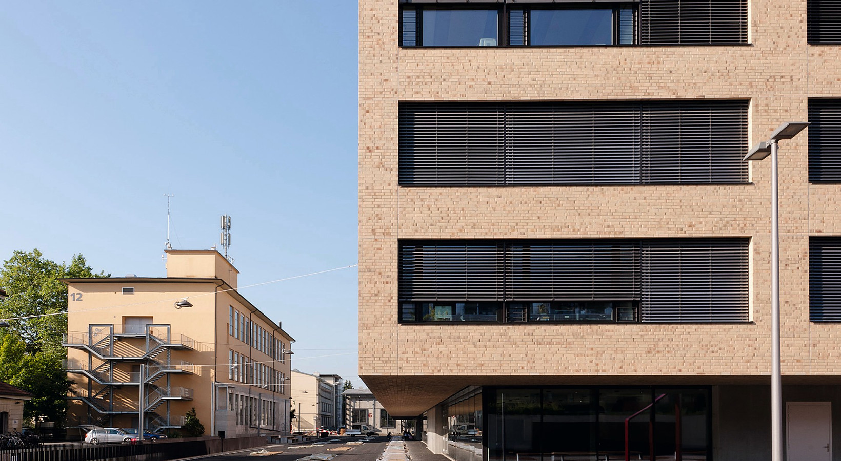
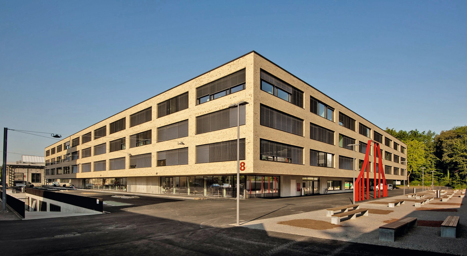
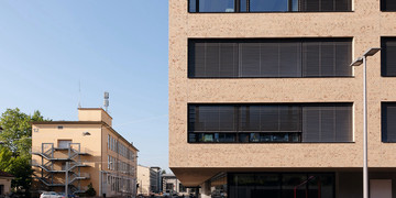
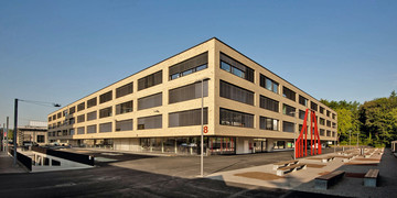
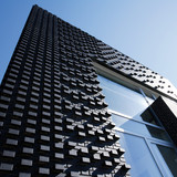
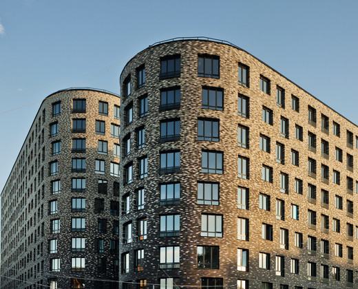
An object from clinker in a city dominated by sandstone façades – such a view is rare in Bern, Switzerland. The concept, however, is not accidental. The building of the Institute of Pedagogy of the University of Bern, designed by Giuliani Hönger, is situated on the area that belongs to the vonRoll company, where its ironworks were located until the nineties.
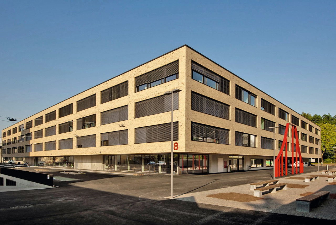
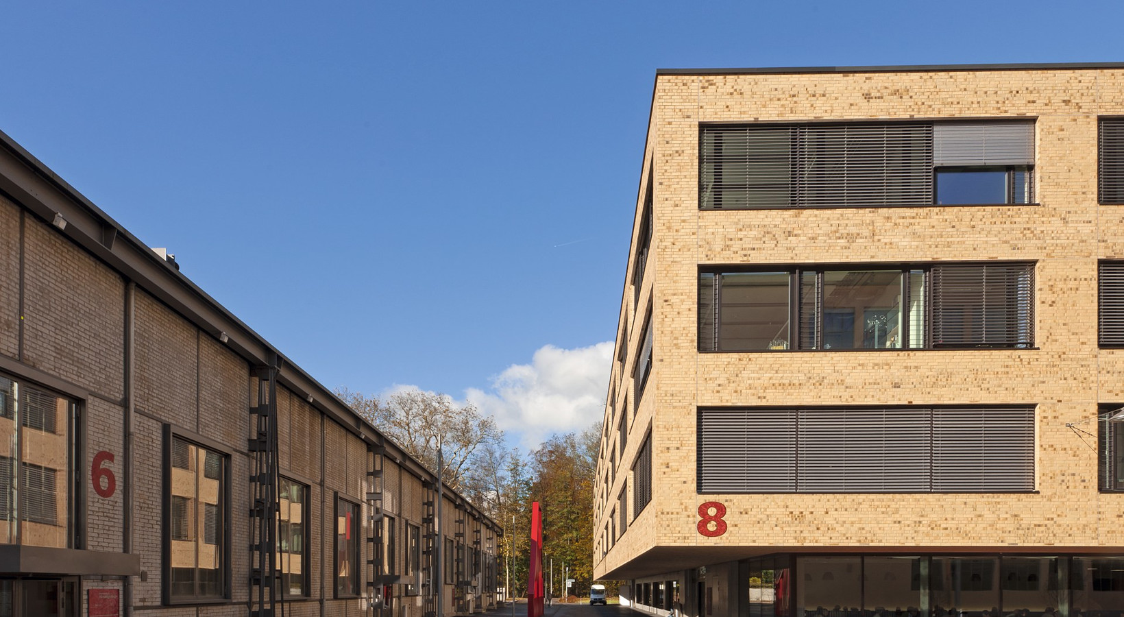
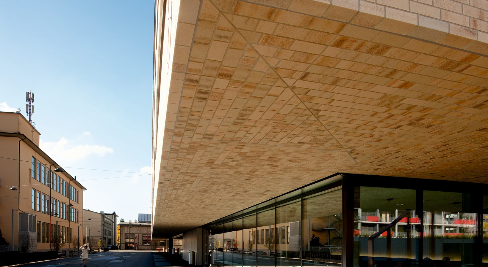
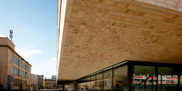
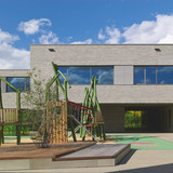
The railroad tracks for the Swiss rail transport were produced here for decades. What is extremely important, the production was located mainly in factory halls built of clinker. The investor and customer – the Bern canton, included this historical background in its profile of urban building requirements, owing to which we managed to achieve an interesting effect, described by a special commission dealing with the evaluation of architecture and art at the Bern canton in such a way: “The building of the institute resembles the industrial past of the area and emphasizes the cooperation of the complex with the existing buildings. The clinker façade adopts the stylistics that predominates in this area, however, it is interpreted in a new way owing to the inserted and partially glazed ground floor.”
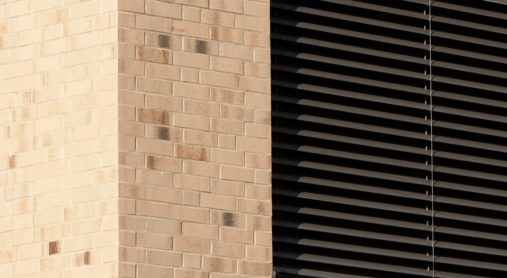
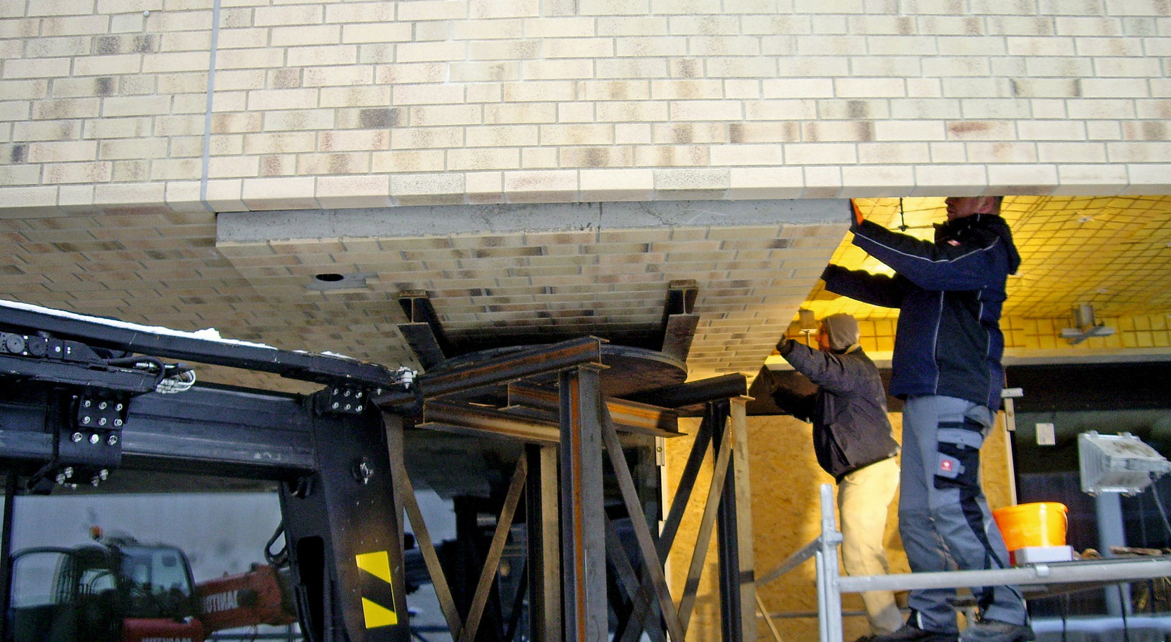
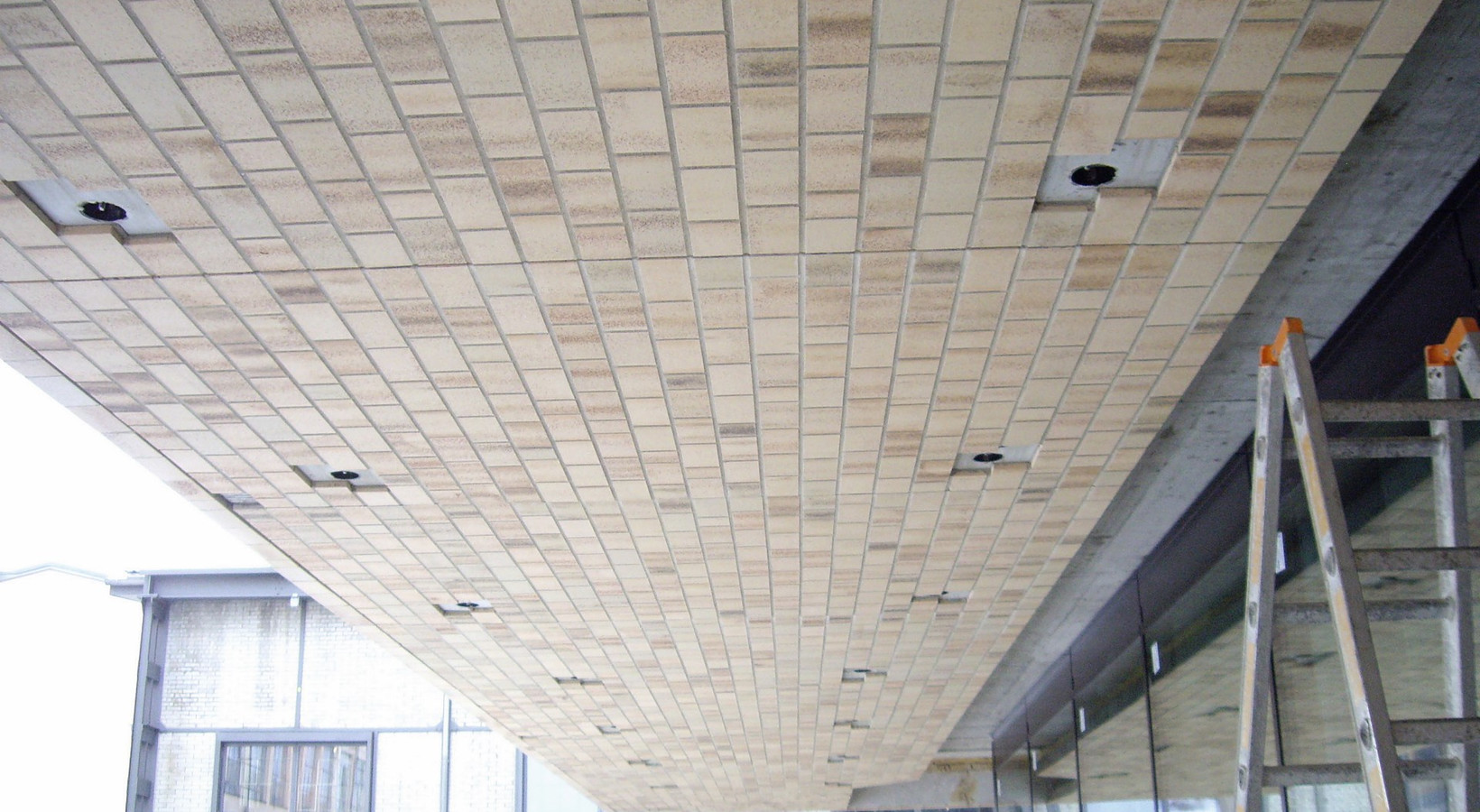
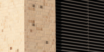
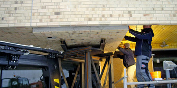
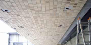
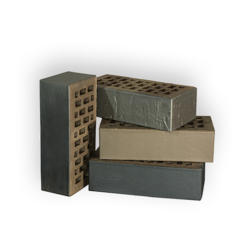
The architects from Spreng + Partner Architekten AG supervised the entire project. Their task was to determine the type of clinker, and they decided to choose from a wide range of Röben products, which as part of the BRICK-DESIGN® program offers almost unlimited possibilities for creating new product and concept solutions. Different patterns and trial brickwork were made in several stages. “Large patterns were set in a scale of 1:1 in the form of walls measuring three by three meters. We referred to the existing buildings in the neighborhood so as to possibly match the colors and shapes of bricks”, explains Spreng. “Together with the investor, we opted for a creamy-white ceramic clinker from Röben, which offers some special properties”, adds the architect. The types of clay were matched to each other so that the façade pattern, owing to shades, contained depth and high accuracy. As a rule, a very simple façade does not give a flat and smooth impression, but the clinker gives it a lively texture. The achieved effect was reinforced by special surface refinement, consisting in sandblasting with various shades of red, which, looking as if they were accidentally scattered, contrasted in a harmonious way with the creamy white clinker. A combination that looks natural and vivid. And it will remain vivid, because over the years and decades, the patina on the façade will constantly change and – in the good sense – grow old. “The appearance of the façade was very important to us, because owing to it, the building makes a huge impression. We did not want to create a bland building body: the clinker guarantees that the object is alive and the façade has a new face. If we decided to use one-color plaster, the building would be totally bland”, Daniel Spreng sums up.
